01 / Operational Dashboard
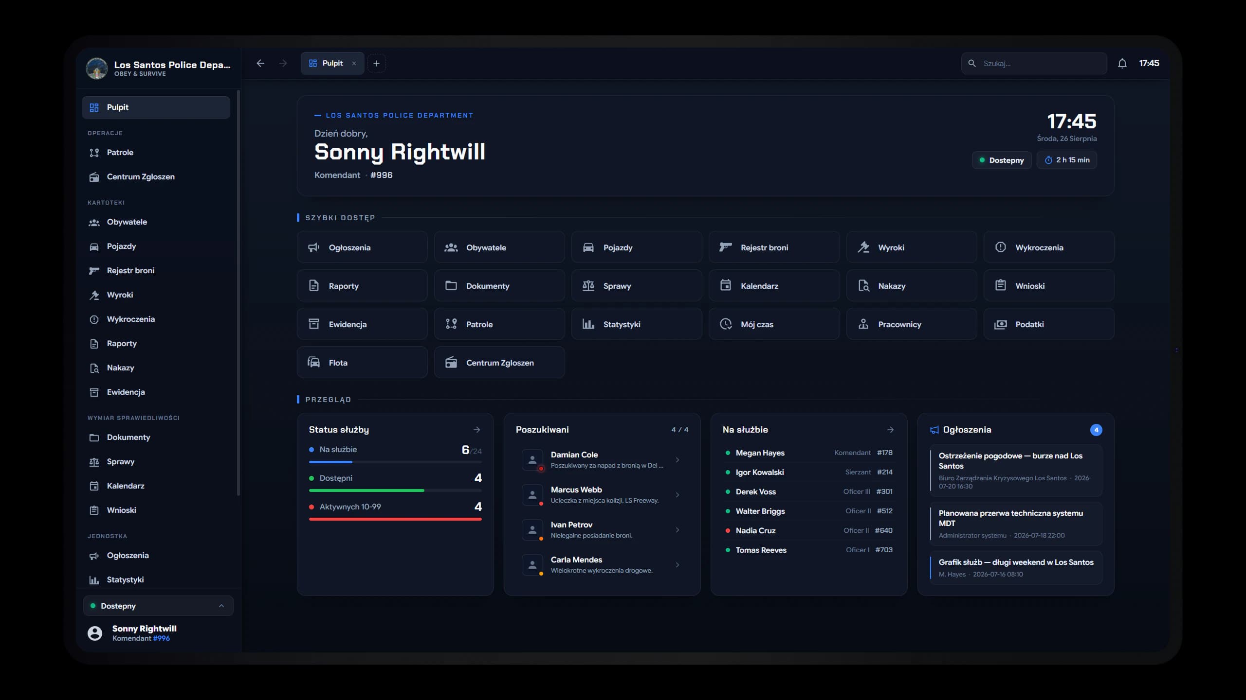
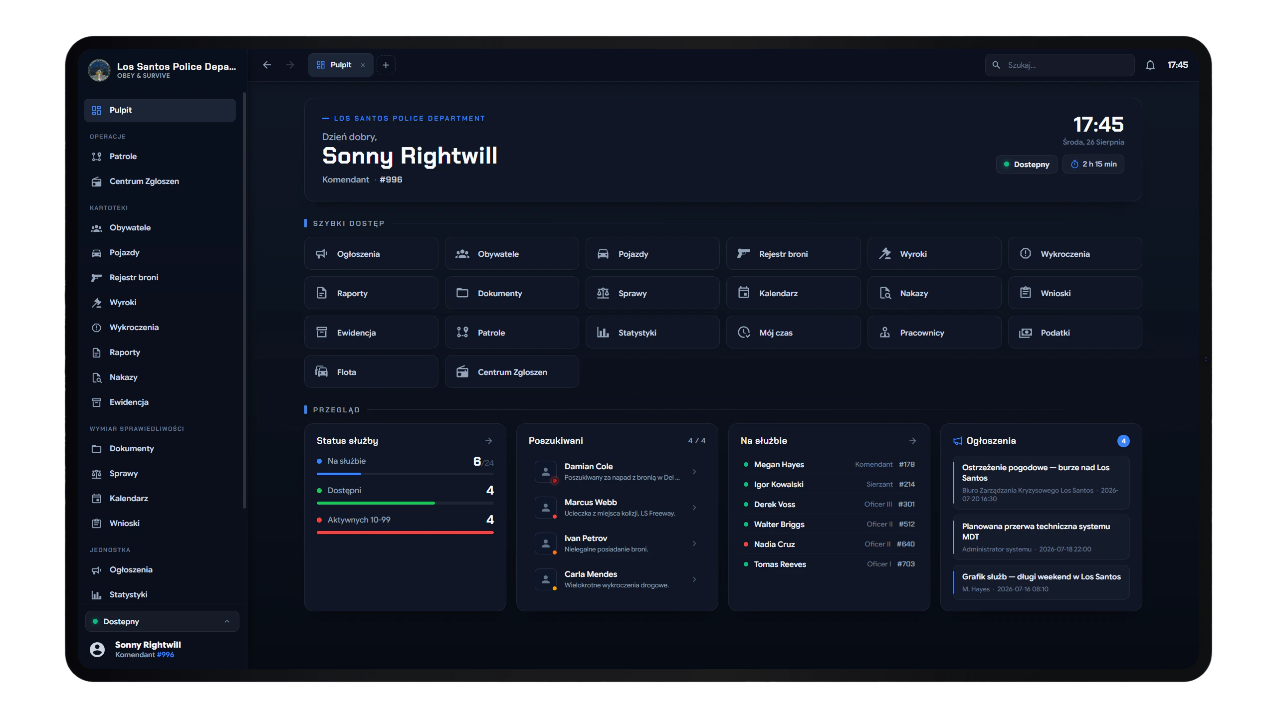
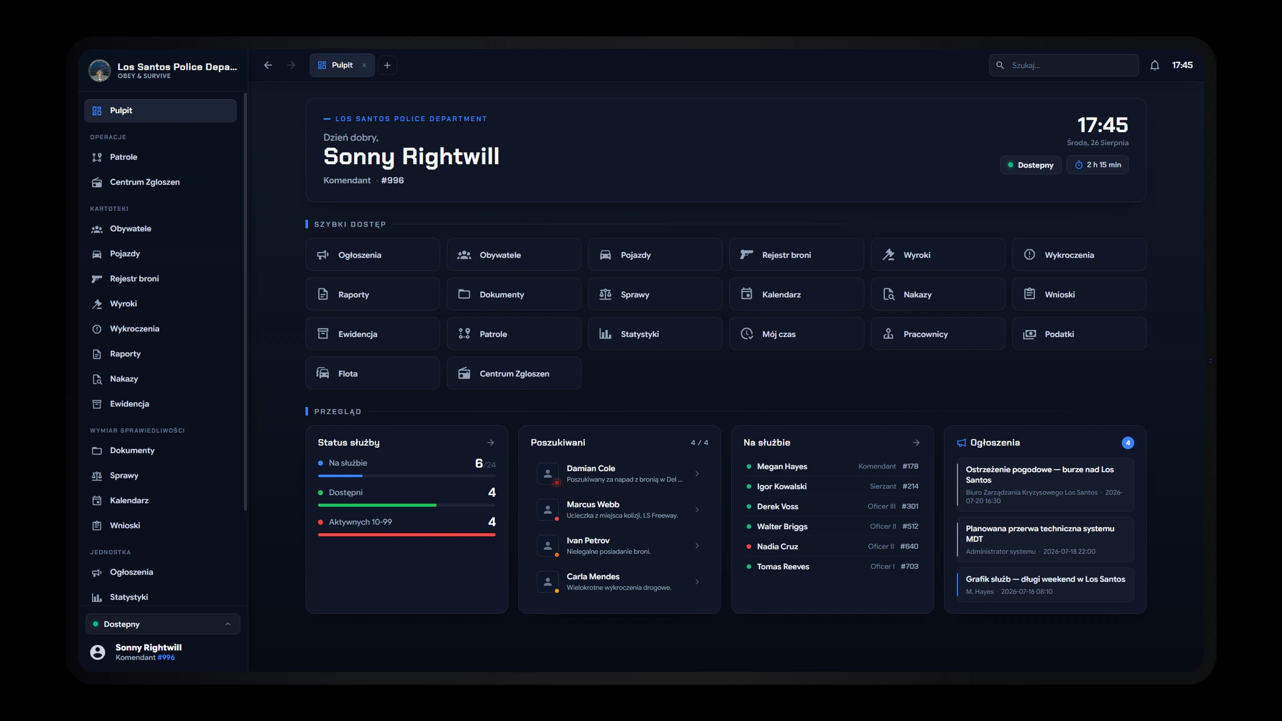
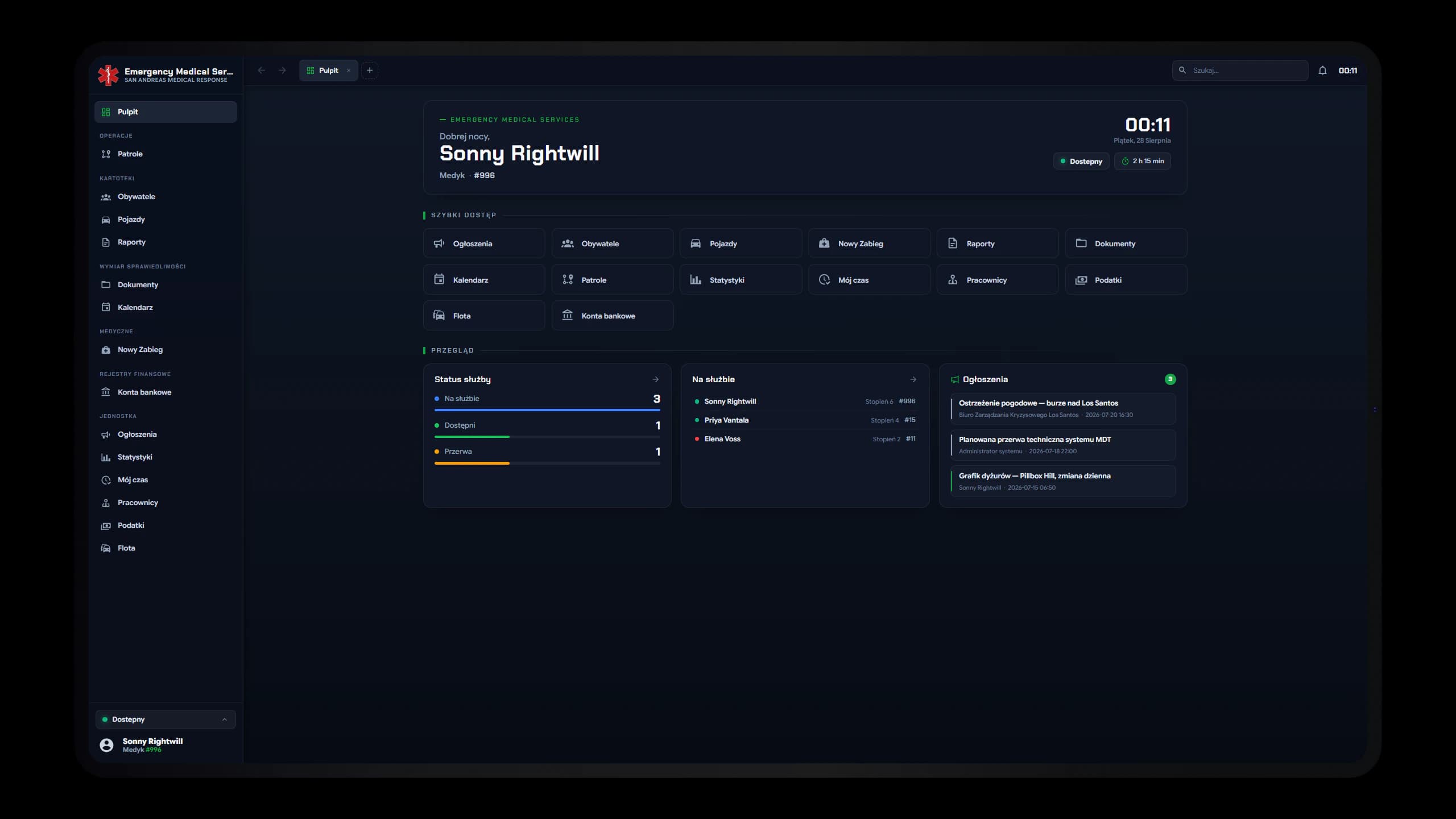
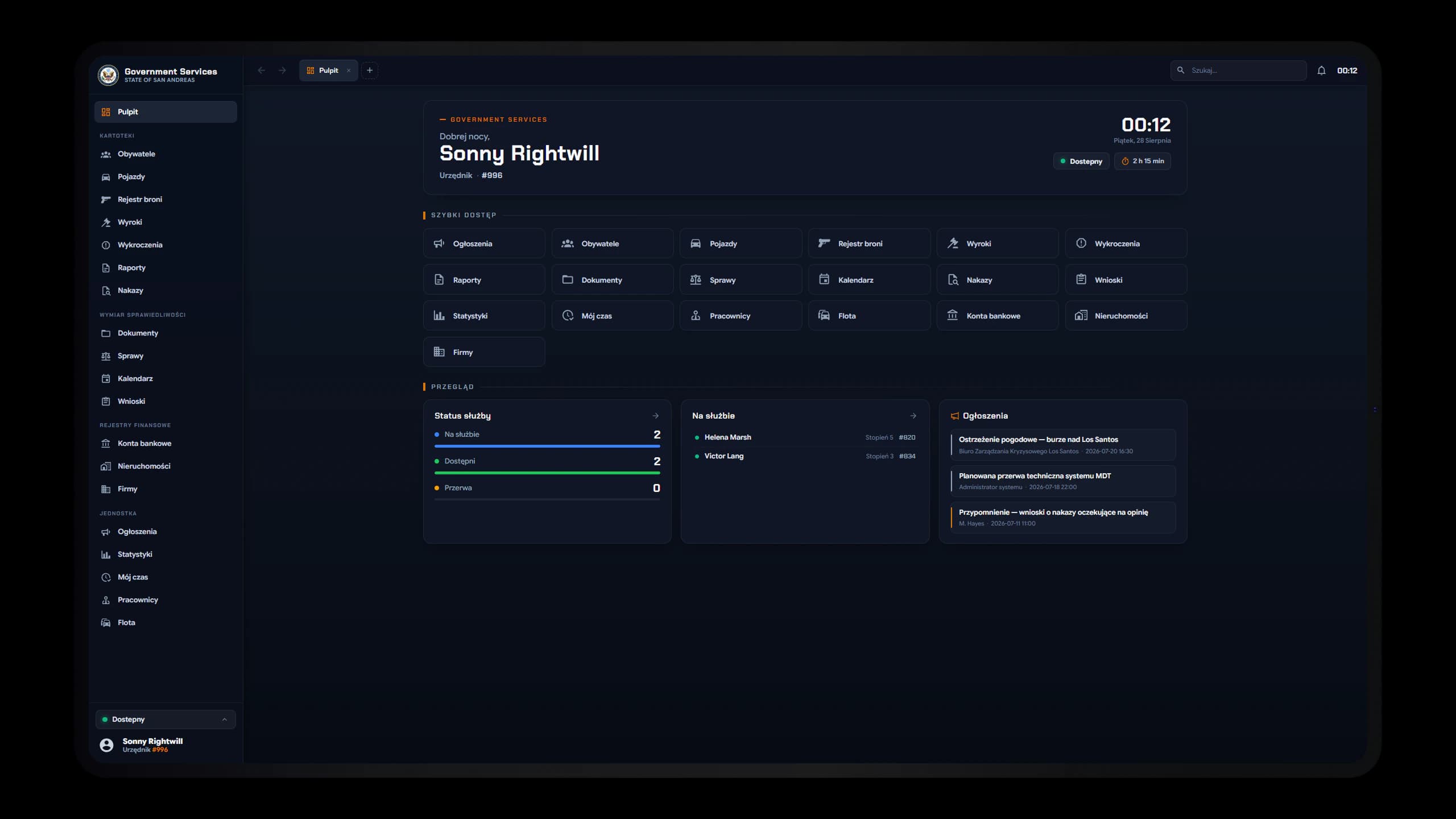
A dashboard should orient, not impress
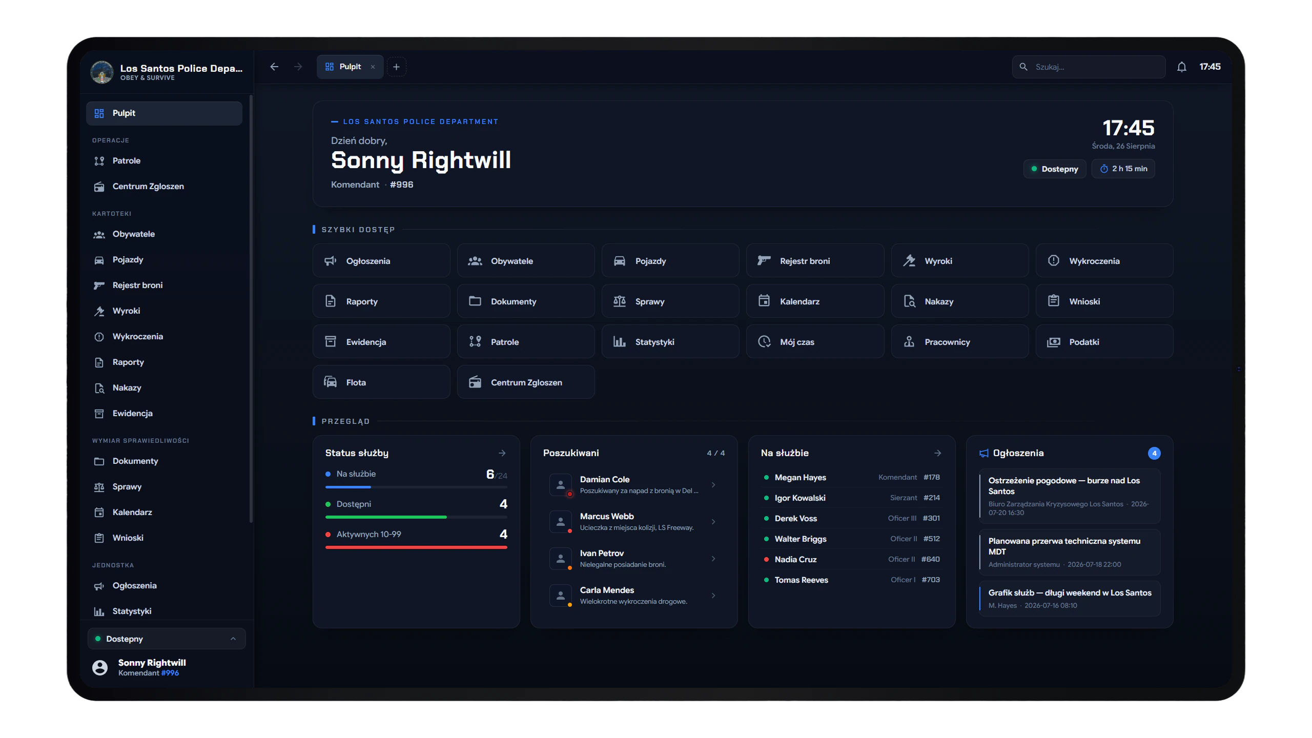
The dashboard is designed as the starting point of a shift. Instead of filling the screen with arbitrary widgets, the hierarchy answers three essential questions in order: Who am I and what is my status? Where do I need to go? And what is happening right now across units and wanted registries?